Skip to the Good Part
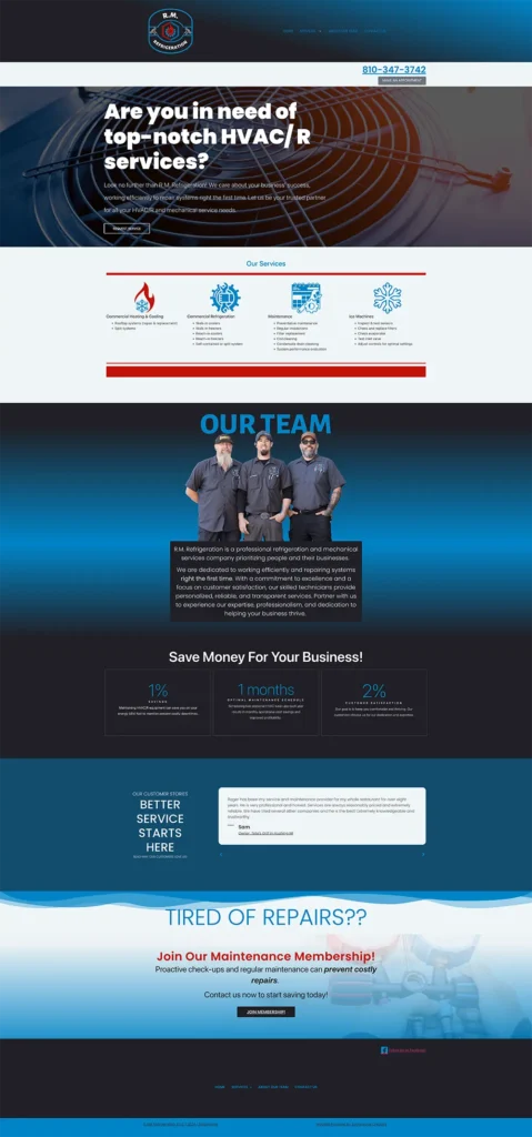
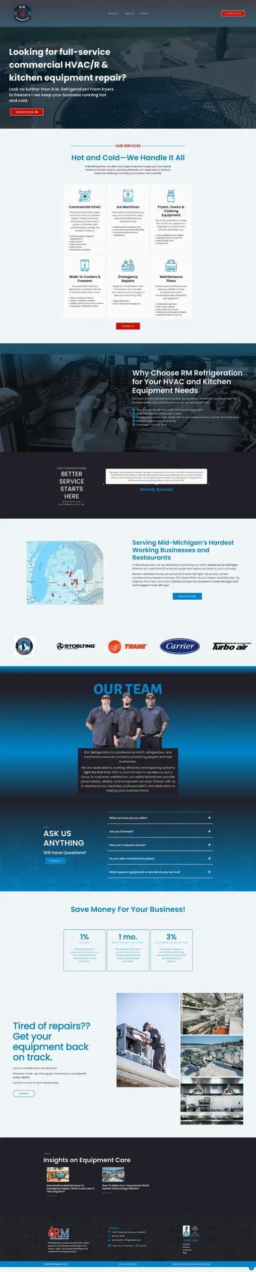
Here’s a quick before/after of a recent website refresh I did. On the surface, it might look like a new coat of paint but under the hood, a lot of intentional strategy behind the scenes went into making this site work harder for the business.
What we did (and why it works)
This wasn’t just a visual update–we focused on making the site more findable, trustworthy, and actionable.
1. Replaced Stock Photos with Real Branding
Instead of generic images, I used personalized brand photography I took of the team while they were on the job. This adds credibility and creates a cohesive, professional feel across the site. The internet is jam-packed with AI garbage now that lacks humanity, we are striving for connection.
2. Researched Keywords and Target Market
We sat down to identify their ideal customers and the language they actually use. From there, I rewrote the website copy to align with high-impact keywords and real customer needs. We made it easier for the right people to find them online.
Let me be clear. It is important to do research and know keywords that people are searching but this is NOT about keyword stuffing just to rank. We want to provide a good experience for your customers and it is incredibly frustrating as a consumer to land on a company website and STILL not have the answers they were seeking.
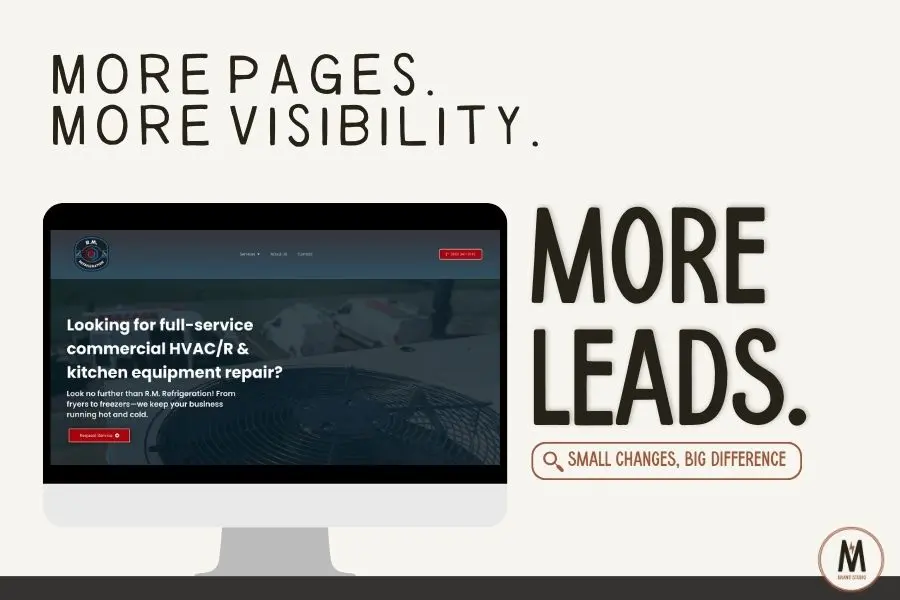
3. Added Pages + SEO Content Strategy
We expanded the site from 5 to 12 pages, including:
-
A dedicated page for each service
-
Content-rich service area descriptions
-
An FAQ section (which also boosts SEO)
-
A blog, which we’re continuing to build with keyword-targeted posts and helpful information
This added structure helps the site rank for both short- and long-tail searches while giving visitors more helpful, relevant info. SEO isn’t about using as many keywords as possible, it’s about showing up with the right words in the right places. This site does that.
4. Improved Trust Signals
We added:
-
Brand logos of supplier and partner companies (hello credibility)
-
More customer reviews and testimonials (social proof matters)
These elements help build trust with new visitors. They provide clear, familiar signals that tell visitors, “You’re in the right place.”
5. Made it Easier to Navigate + Take Action
We:
-
Simplified the menu and added a sticky header with contact info always visible
-
Placed clear CTAs and contact forms throughout the site
Now, no matter where someone is on the site, getting in touch is just one click away.
6. Optimized for Local Search
I implemented schema markup and coordinated updates to their Google Business Profile so they’re more visible in local search results.
Early Results (and We're Just Getting Started)
In the first month post-launch:
Search impressions and direct inquiries increased
Domain authority jumped from 5 to 7
We’re continuing to build SEO strength weekly
- We’re building their brand identity with each interaction, making sure that who they are and their mission is being communicated
It’s early–but it’s already working.
If You're DIY-ing Your Website...
Here are 3 high-impact changes you can make right now:
Swap in real photos of your team
Simplify your navigation and make contact info obvious
Make sure your copy uses the same words your clients would type into Google
Want help spotting what’s working (and what’s not) on your site? That’s literally what I do! Check out my services like the Brand Audit.
See the before and after